Sources

This project draws on a dataset from Data.World that compiles biographical and demographic information about Nobel Prize laureates, such as birthplace, motivation statements, and gender. While the dataset is tidy and factual, it also reflects the limits of what institutions choose to record. Michel-Rolph Trouillot’s reminder that “any historical narrative is a particular bundle of silences” (Trouillot, p. 27) helps clarify what is missing here: the broader cultural, political, and structural conditions that shape who even has the chance to become a Nobel laureate. Countries with strong research infrastructures and stable political environments appear frequently, while those without these advantages are nearly invisible, making talent appear to be absent, but opportunity is just unevenly distributed. These omissions echo critiques in digital humanities that datasets often mirror institutional priorities and can hide the power dynamics behind the numbers. By intentionally using this dataset as our primary source, we acknowledge that the first level of any DH project, its sources, is already shaped by choices and silences that influence every interpretation that follows.
Processing
For the processing stage, we organized our dataset in a way that would let us study our research questions with clarity and consistency. After collecting information about each Nobel Prize winner, we entered everything into Google Sheets and grouped it using identifiers like birthplace, death location, gender, and stated motivations. Building these categories was important because, in digital humanities work, metadata shapes what we are able to see later on. Google makes a similar point in its update to Google Images, noting that it “added Creator and Credit metadata in photos it displays on Google Images” so that users can better understand where digital materials come from and how they should be interpreted (Google Search Central, 2023). Following this logic, we created a structured metadata system so our data would remain clear, traceable, and meaningful once we moved into computational analysis. With this foundation in place, we shifted to visualization tools such as Tableau to look for patterns related to national background, education, and political context. Overall, the processing stage required both technical organization and critical reflection so that our later visualizations would be from a reliable dataset.
Presentation

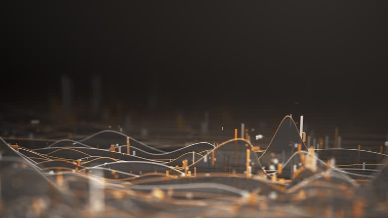
In the presentation stage, we synthesized our dataset into visual and textual formats designed for easy interpretation. We created a geospatial visualization that maps the birthplaces of Nobel laureates, which helped us identify broad geographic distributions and disparities. This mapping and visualization reveal structural patterns that are difficult to see from individual cases alone, and it also supports our readings’ highlight that “as you explore relationships between variables, don’t confuse correlation with causation” (Yau, p. 179). Keeping this in mind shaped the way we presented our findings because our goal was to highlight inequalities without suggesting that birthplace alone determines who becomes a Nobel laureate. We also developed explanatory narratives that clarify our methodological choices, contextualize the trends we observed, and acknowledge the limitations of both the dataset and its visual representation. The goal of our final presentation is to give viewers an interface that shows global patterns while encouraging critical reflection on how birthplace, educational access, and systemic inequality influence the pathways that lead to a Nobel Prize.
Meet the Team!
Celeste Cortez
Data Visualization Specialist
Hi, I am a 3rd year Neuroscience major with a minor in Digital Humanities. As the Data Visualization Specialist, I created the timeline for the homepage, and helped visualize our dataset into comprehensive models.
Jennifer Lau
Data Analyst
Hi, I am a 3rd year Statistics and Data Science student. As the Data Analyst, I wrote the analysis for our data visualizations and synthesized ideas between our dataset and our sources, connecting our ideas to our research questions.
Charlie Kopp
Data Management
Hello! I’m a 4th year Statistics and Data Science major, Digital Humanities minor. My role for this project included formatting data (text-mining + summarizing) to create insightful visualizations, as well as source gathering and analysis.
LinkedIn | Personal Website

Nicholas Garcia
Web Designer
Hi, I am a 4th year Sociology major with a Labor Studies minor. My role for this project was Web Designer, where I created and wrote the About Us page, as well as contributed to our sourcing, processing, and presentation work.
Renee Lu
Project Manager
Hi, I am a 3rd year Cognitive Science Major with a minor in Digital Humanities. As Project Manager, I oversaw the project tasks, making sure we were organized and on track. Moreover, I compiled all our work and created compelling data visuals.
Victoria Yee
Content Developer
Hi, I’m a 4th year Statistics and Data Science student with a minor in Digital Humanities. I assisted Renee with project management duties, and the Content Developer, I helped curate the website’s aesthetic and organization.
Acknowledgements
We would like to thank our professor, Dr. Wendy Perla Kurtz, for her guidance and thoughtful feedback throughout this project. We are also grateful to our TA, Kai Nham, whose support in section and office hours helped us refine our questions, organize our data, and strengthen our visualizations. Their encouragement and insight were essential to completing this work!